Kids & Culture Camp wanted to enhance their website experience and make signing up easier for their target market. Their goal was to continue to serving children, with a mix of economic classes, while ensuring that children of color experience Kids & Culture Camp’s high-quality international enrichment program. When Kids & Culture Camp Founders contacted SMG, they were completing a brand story mentorship program to create target-rich messaging. Besides updating their message and website, Kids & Culture Camp wanted to create an entirely new visual identity and logo.
navigate
the plan
In the previous website, because there were a lot of pages, we created a new website outline and site map to better organize and condense the contents. As a communication tool for the parents, it was important for the most action-inducing content to stand out, such as programming, and not be buried among layers of pages and words.
Kids & Culture’s target includes parents or caregivers of children between the ages of 3-12 as well as residents of Washington DC between 30-45 with children. Kids & Culture desired a website to draw in
the impact
- Vivid and stunning website showcasing Kids & Culture Camp’s activities, staff and programs
- Increased enrollment due to ease, look, and feel of website
- Organized content and structure to guide target market throughout website
- Created hub of activity for enrollment, payments, etc.
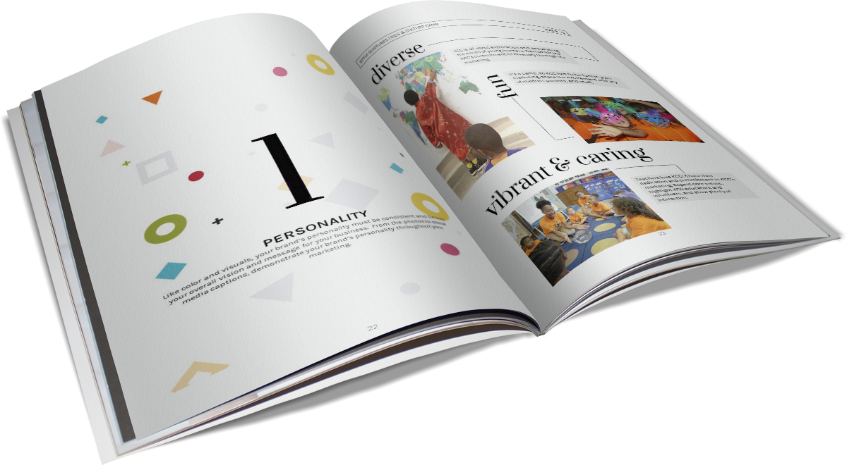
Brand Identity
Vibrancy, playfulness, and energetic was the common theme for the new brand identity for Kids & Culture Camp. Using vibrant color and playful graphic language, we gave vision to their core values, message, mission, and overall brand mood.
Core Values. We Value Love. We Embrace all Cultures. We Believe in Mindful Living.
Brand Adjectives. Diverse. Engaging. Vibrant. Clean. Playful.
COLOR PALETTE
With such a vibrant and diverse palette complimenting Kids & Culture’s content and programming, it was important to pair top-tier information with primary colors and secondary information with same. We also used color to group similar call-to-actions, sections, and page layouts.
primary color palette
secondary color palette
PATTERNS & ICONS

LOGO
HEADINGS/QUOTES
AaBbCc
1234
ABCDEFGHIJKLMNOPQRSTUVWXYZ
1234567890!@#$%^&*?
subtitles
AaBbCc
1234
ABCDEFGHIJKLMNOPQRSTUVWXYZ
1234567890!@#$%^&*?
BODY TEXT
AaBbCc
1234
ABCDEFGHIJKLMNOPQRSTUVWXYZ
1234567890!@#$%^&*?
Our collaboration with Kids & Culture Camp resulted in a fresh and vibrant website that showcased their imaginative programs, dedicated staff, and growth as they continue to serve underrepresented children in Washington DC.
Website Design
First, we created a Site Map to outline and name the new or revamped pages that were needed. These pages focused on money-generating activities. Besides simplifying the new design, we also simplified the navigation menu, so money-generating pages, such as Register and Camp Info; would appear first while second-tier pages where placed in a drop-down menu.
We then created a Site Map Outline to list the desired content on each page. For example, the new home page included videos, blog posts, etc.


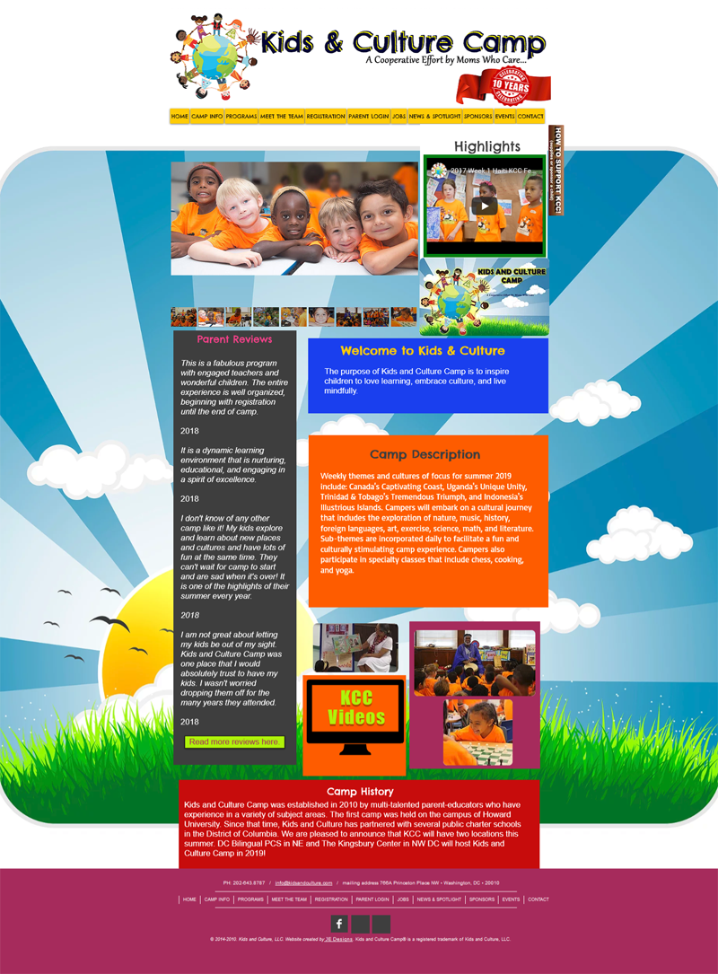
On the previous website, there was a page for every piece of information, which cluttered up the website making it difficult to navigate and understand. Another key action we took was to combine the relevant pages and section various content by color blocks, photos, etc.
BEFORE
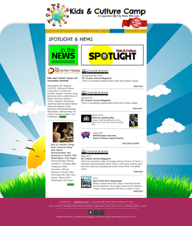
AFTER
(hover and click arrows to view more pages)
")
")
")
")